Hey Everybody,
First and foremost, from all of us at UX Edmonton thanks to all of you who came out a couple of weeks ago to the Mobile Content Strategy workshop that we ran at Startup Edmonton. Quite a few of you made it out which is great to see and very positive for the community.
For those of you who weren’t able to attend here’s what you missed:
- nForm’s brilliant and gracious Gene Smith presented an overview presentation of the Mobile Content Strategy and held a little Q&A afterwards.
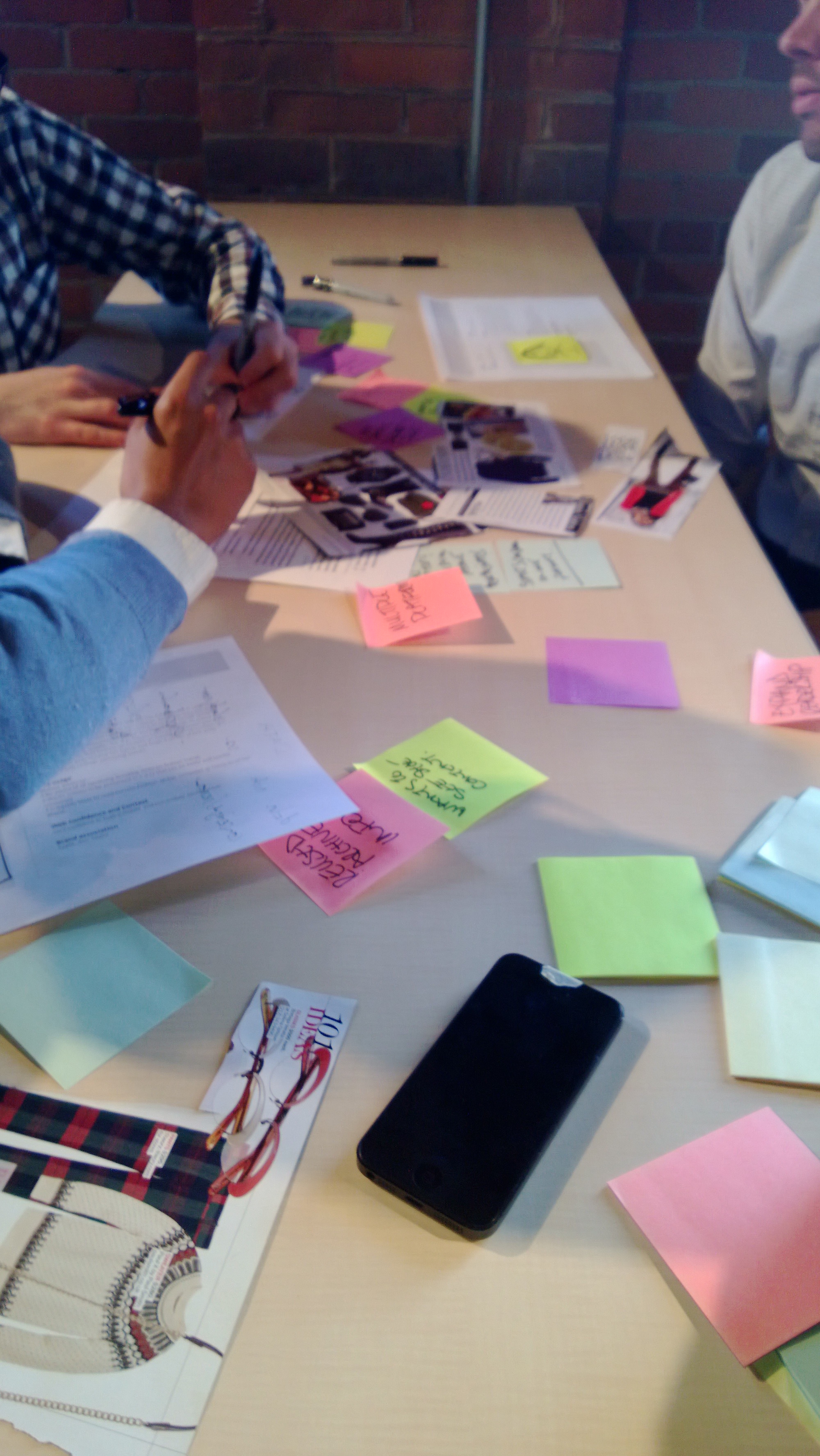
- We presented a faux-case study for a fashion magazine. Our first mission: create a content strategy that could satisfy the needs of our users across a multitude of platforms. The first step was to define how our content should be structured, categorized and classified.
- We split into separate groups and you guys just went for it.
- We presented our ideas and shared some laughs.
- We proceeded to our second mission: Come up with a visual representation for our strategy on a desktop and mobile platform.
- More sharing ideas, more laughs
There was an awesome mix of people from a variety of backgrounds, industries and levels of experience all contributing produce a content strategy in a short period of time. It’s hard to sum up all of what was learned during the workshop (there was oh-so-much) but from my own view the most successful groups:
- Weren’t afraid to breakdown their content for a variety of uses. For example, if you are writing an article for a magazine, is one title going to cut it? Or will you need to write a long title and a short title that can be used depending on context. Groups that took a modular view of their content were able to respond better to changing circumstances.
- Realized that context rules supreme. Images, tables, graphs, charts – are all these things going to be displayed consistently across platforms? This might have been the most overlooked aspect, but not all content will scale well – If you display data in a chart in a desktop you may need to go back to the drawing board if you want to display that data on a mobile device.
- Created flexible metadata strategies . Breaking down content into modular chunks is great, but so is categorizing your data. Groups that took the time to add some categories in which to classify there data saw benefits when they started to think about how their content will be used.
- Revised, revised, revised. When some groups were creating their visual representations, they weren’t afraid to revise their strategy if they noticed gaps. Sometimes seeing is believing and a visual artifact can expose holes in your design.
So to recap: fun + learning + chairs = UX Edmonton’s March Meetup!
Next meet-up is April 23rd where we will be looking at some exciting case studies!
Hope to see you there!